


Everton: A Race To The Bottom
David Lloyd reflects on a sad chapter in the Blues' history. But he doesn't do it in that old Latin shit.
How proud would your mum be if all you did for a living was shave the pointy bits off fonts?
Ours neither.
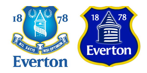
The worst thing about Everton-gate? It wasn’t that the so-called People’s Club ran roughshod over the feelings of the, um, people (I’m a Blue, but I’m not so feeble-headed as to think that The People’s Club is anything more than a brand extension). No, the worst thing is that it reveals a inconvenient truth: that Everton have succumbed to the deathly hand of the branding police.
What they’ve shown, spectacularly, is that, while they’re masters of achieving a lot with very little, they’re also pretty adept at spunking their precious loose change up the wall too.
Still, at least they saved money on their contrite apology. They obviously got their nana to write it:
“Our solution, in a globalised, technology-led world,” they say, in a way that makes those words sound like a vicar talking about cunnilingus, “was to present one word, loudly and clearly.”
Hey, Dictionary Corner, isn’t Fuck-up technically two words?
Now listen carefully, nana’s about to give us all the science:
“Effective logos are simple and streamlined. Simplicity achieves stand-out recognition. This was our starting point for our new Crest.”
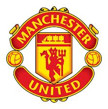
OK. I see your simple and streamlined logos, and I give you Manchester United.
A red devil holding a trident, a three masted schooner at full sail, two footballs and swirly ribbony things top and bottom (sorry, heraldry GCSEs were dropped at our school. Bloody THATCHER)
So, yeah. How the hell are Man U ever gonna shift any merch? They’ve completely failed Nanna Everton’s logo masterclass there, haven’t they?
Oh wait, what’s that? Manchester United shifted £135 trillion worth of official coaster sets last year. In Thailand alone?
Woah.
See, the problem with the brand police is that they’re running scared. One day, we will all wake up and realise: they do fuck all, and what little they do is built on the sort of logic that gave us New Coke, Lisa Simpson pleasuring Bart in the Olympic logo, Marathons becoming Snickers (still furious about this one) and everything that’s WRONG WITH THIS COUNTRY. We should be building cars. Instead we’re deconstructing crests.
The problem is - there was no problem with the crest. The problem is, EFC is not a big brand around the world. Solution? Change the one distinctive thing about them, and lose those nonsense phrases: I mean, they’re not even real words. They’re just lorem ipsum placeholder words for fucksake, yeah?
![]() Such is the deadheadedness of the branding police. Just because they didn’t study a ‘proper’ degree, they think the rest of us are too thick to know what a Vivarium is, so they insist our museum call it The Bug House. Great, until you realise that, etymologically speaking (oh wait, more nonsense words) most of the creatures in there aren’t of the insect order Hemiptera.
Such is the deadheadedness of the branding police. Just because they didn’t study a ‘proper’ degree, they think the rest of us are too thick to know what a Vivarium is, so they insist our museum call it The Bug House. Great, until you realise that, etymologically speaking (oh wait, more nonsense words) most of the creatures in there aren’t of the insect order Hemiptera.
Still, no matter. It’s good to see that Everton’s branding police have really taken hold in the city. They’ve applied their rigorous, science based methodologies to that totally unstreamlined and downright ugly bird on the Liverpool crest.
We hope you like it. Now can we get on and focus on the trivial shit, like finding a decent manager with smooth edges and a name that looks lovely in Helvetica? Thank you.


» Sport & Active » Feature » Everton: A Race To The Bottom
4